The brief
Tri World Capita offers fractional ownership: a way for more people to invest in property, with transparency and without the usual barriers. The company needed to look and sound like what it promises, from the first logo to the way its own team talks about the work.
The approach
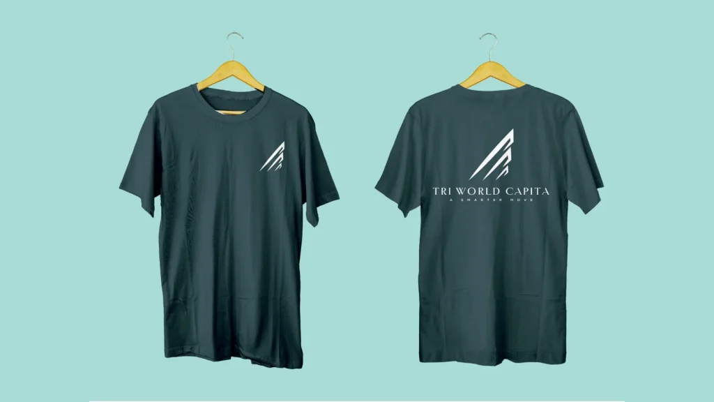
Give the idea one symbol. The mark is built from rising peaks, a small leap upward that reads as growth and as the landscape the company invests in. It was drawn to hold up at every size, from a billboard to a favicon, and has light, dark and gold variants for each surface.
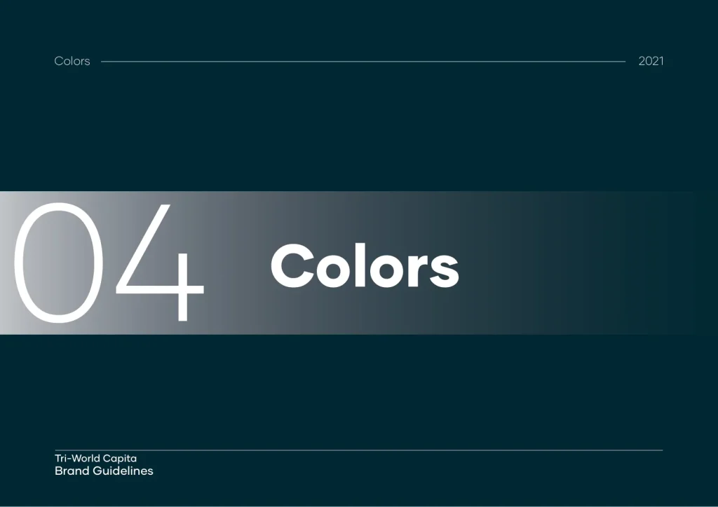
Build a system, not just a logo. The brand guidelines set out the purpose, the values, the colour palette, the typography, clear space, responsive versions and a plain do and don’t list. Anyone, inside or outside the company, can use the identity correctly without asking.
Carry it inside the company. The employee handbook turns the brand into behaviour: a core purpose, five core values and a manifesto written in the first person, so the team owns the promise before customers meet it.
Tell the story investors can repeat. The pitch deck frames fractional ownership as a shift from transactions to relationships, using familiar companies that changed how people buy, so a new idea feels like a natural next step.
The identity system
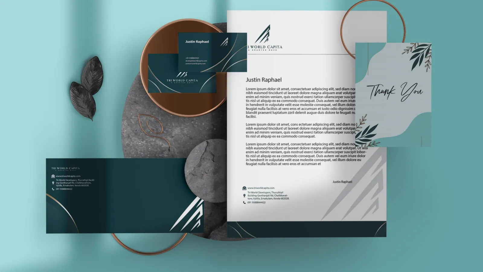
Selected pages and mockups from the guidelines, with the stationery set shown above. Select any image to enlarge it.



The pitch and the people


What the work covered
Developed together with Ergo Consulting Services and Mettle Minds.